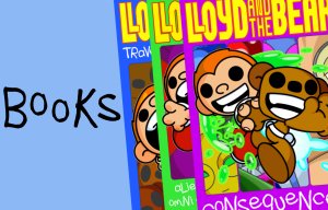
Okay, this was a fluke(!)

Okay, so this is a quick one but I wanted to mention the layout for issue #3. See, I mean what I say when I don’t plan things and when it came to doing three story arcs in one issue and wondering how I’d lay it out I realised that, duh, I already set it up back in issues #1 and #2 with the three panel opening page!

This totally cemented how the book was going to look which was great! Again, I was absolutely crazy lucky with this! You’ll notice that this was the first time I had a subtitle to the title and also the first time a title was used three times across the issue (seriously, there’s a lot of 3’s in this issue!) but otherwise each book has the same look.
I will admit there was a plan at times to maybe have three vertical panels on a page but I decided against it as this book was confusing enough to follow!
But yeah, I was really happy with how this turned out! Was it… meant to be?
More soon! Bear hugs!


